Listen to the audio version of this article (generated by AI).
Managing Editor’s Note: Today, we’re hearing from our contributing editor Mike Burnick in his weekly feature.
Mike has over 30 years in the investment and financial services industry – from operating as a stockbroker, trader, and research analyst, to running a mutual fund as a registered investment advisor and portfolio manager, to being Research Director for the Sovereign Society, specializing in global ETF and options investing.
And he’s been senior analyst at TradeSmith for three years, running Constant Cash Flow, Infinite Income Loop, and Inside TradeSmith.
Here’s Mike…
Let’s Take a Quick Check-Up on Market Health
BY MIKE BURNICK, CONTRIBUTING EDITOR, MARKET MINUTE
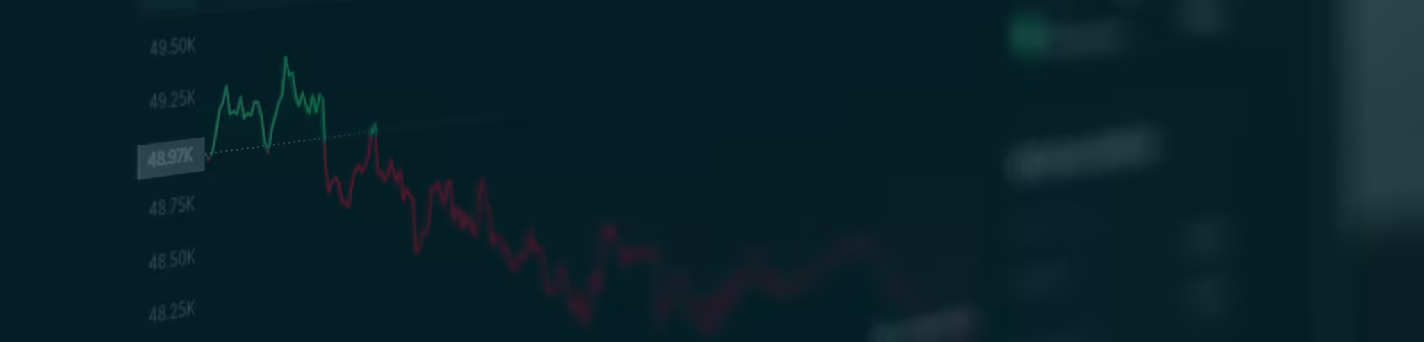
Stock market turbulence is on the rise as investors debate the merits of massive tech spending on the AI buildout.
That’s why you should keep a close eye on the TradeSmith Markets page. It’s a valuable resource to visit frequently to keep tabs on market health.
At a glance you can see which market indexes, sectors, stocks, and ETFs (even commodities and cryptos) are rising, and which are falling.
Simply log in to your TradeSmith Finance account and click on the Markets tab in the main menu, then on S&P Sectors.
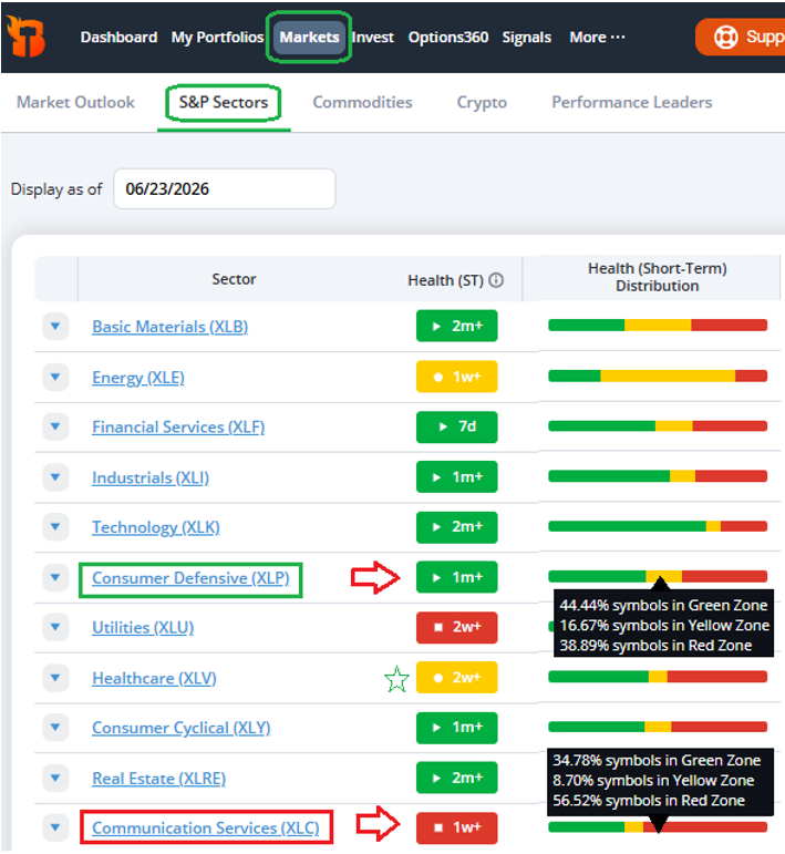
As you can see above, a snapshot of the S&P 500 shows improvement in Consumer and Healthcare sectors.
Our Health Indicator system uses three color-coded health states, green, yellow, and red, just like a traffic light.
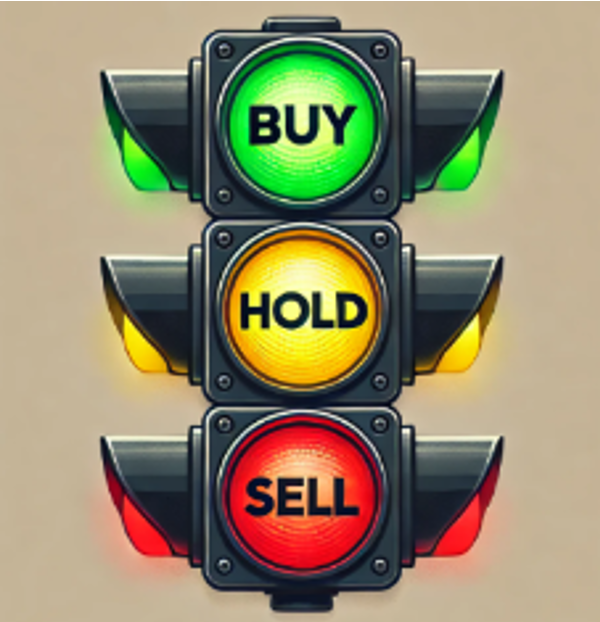
An asset that’s Green is the strongest and healthiest state.
Yellow is still healthy but has declined in price. It signals to proceed with caution, just like a flashing yellow light.
Red signals a deeper correction that we no longer consider healthy. Stocks, sectors and other assets in the red zone should be avoided.
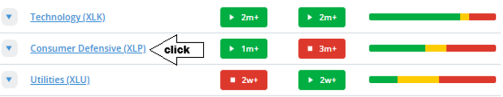
As you can see, Consumer Defensive (XLP) stocks recently moved into the short-term Health indicator green zone, the strongest, healthy state.
And Healthcare (XLV) moved up from the unhealthy red zone, back to yellow, an improvement.
But you can also quickly see deterioration for Communications Services (XLC). It dropped into our short-term health red zone, which could mean more downside ahead.
Hover your mouse over the green, yellow, and red Health Distribution bars and you can view the percentage of Healthy and unhealthy stocks in each sector.
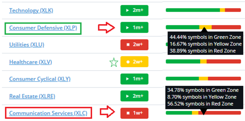
For example, the Consumer Defensive (XLP) sector has 44.4% of stocks green and just 38.89% red, with 16.67% yellow.
But Communications Services (XLC) has less than 35% of sector stocks green, with 56.52% red and 8.7% yellow.
This quickly tells you there are more prospects for winning stocks to be found in the Consumer Defensive sector. Meanwhile, there are far fewer healthy stocks in Communications Services.
You can also dig deeper by clicking on the blue highlighted sector links to view more detailed TradeSmith data about the sector and every stock in that sector.
Simply click on Consumer Defensive (XLP) for example, and it brings you to the Overview page for that asset. Then click on Holdings, as shown below, to view all stocks in the sector.
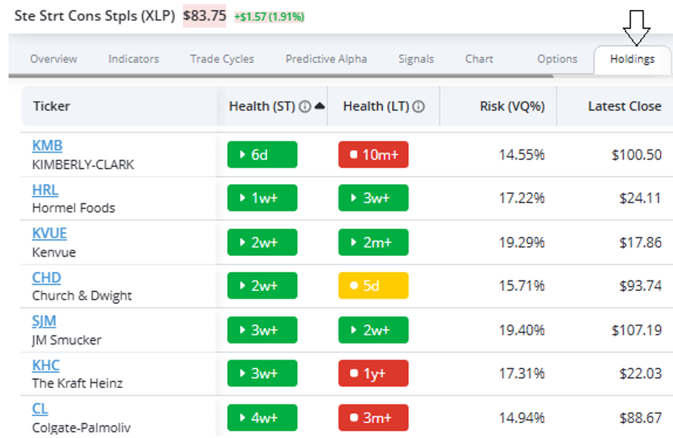
Sort by the Health (ST) column and you can view improving stocks that recently moved into the green zone at the top.
As you can see, seven consumer stocks, all household names, improved enough over the past four weeks to go Green. The most recent was Kimberly-Clark (KMB) just six days ago.
Bottom line: The TradeSmith Markets page is a destination you should visit often to keep tabs on rapidly shifting market trends. Here you can see at a glance which markets, sectors, stocks and other assets are healthy and getting better. And which are unhealthy, which you may want to avoid.
Good investing,

Mike Burnick
Contributing Editor, Market Minute