As stock market pullbacks go, the recent drop was mild with the S&P 500 Index down just over 5.5% at the low before Thanksgiving.
It was more of a slump in speculation rather than a broad stock market decline.
For instance, the tech-heavy Nasdaq 100 fell 8.8%, much harder hit than the S&P 500 Equal Weight index, down only 4%. And the rebound rally since then leaves the equal weight S&P just 1% away from new record highs.
For my money, the equal weight index is a far better measure of the “average” large cap stock. That’s because it’s not dominated by a handful of huge stocks (Nvidia, Microsoft, Apple, etc.) like the capitalization-weighted S&P 500 is.
It was these mega-cap giants, plus the market’s hottest stocks, that were hit hardest.
Just take a look …
- WisdomTree Quantum Computing ETF (WQTM) -21.3%
- Themes Generative AI ETF (WISE) -19.5%
- Bitwise Crypto Innovators ETF (BITQ) -34.4%
It was mainly a speculation selloff among the most overheated stocks and sectors – especially anything crypto-related.
Meanwhile, the average stock barely budged, as measured by the equal weight S&P 500, and some sectors moved higher as the hot money rotated into cheaper alternatives:
- Healthcare +10.2%
- Transportation +1.7%
- Consumer Staples +2.9%
And it’s possible that this speculation selloff isn’t over yet. It could turn into a bigger correction (-10% or more).
But there is an easy way to keep an eye on the underlying health of the stock market, by periodically checking the TradeSmith Market Outlook page.
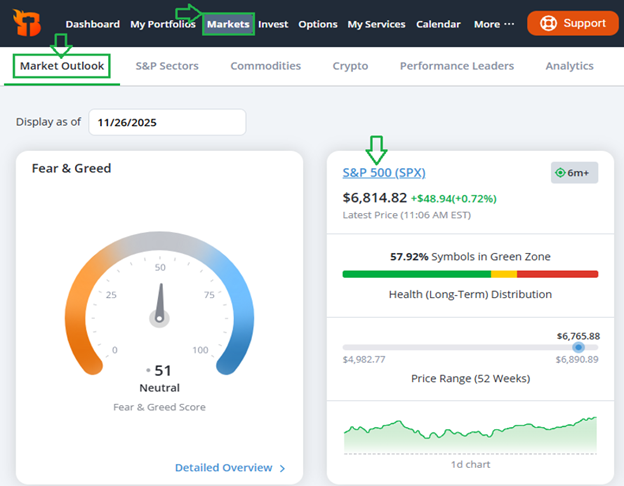
Subscribers with access to this valuable data can simply click on the Markets tab from the main menu bar, then select Market Outlook.
Next you can choose to click on several major indexes including the S&P 500, Nasdaq 100, Dow Jones Industrial Average and more, to dig deeper.
Pay particular attention to our Health Distributions section shown below for a valuable snapshot of market breadth.
Specifically, you’ll see a detailed breakdown including:
- Health indicator distribution (Green, yellow, or red zone)
- Trend distribution (up, sideways or downtrend) and
- Stock Rating distribution (ranging from Strong Bullish to Strong Bearish).
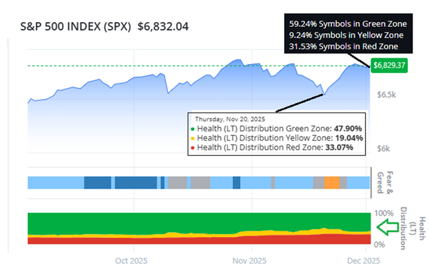
Keep an especially watchful eye on changes to the Health Indicator Distribution. This is our simple traffic-light system (green=go, yellow=caution, red=stop) and it’s designed to help you quickly assess the health of any stock, or an entire index, like the S&P 500 shown above.
To quickly see how healthy stocks really are, I look at the difference between green and red zone stocks, which is shown in the distribution by hovering over that section of the chart.
Here’s what to look for…
As you can see in the white box in the chart above, at the recent low, the number of green zone stocks was 47.9% while the number of red stocks was just 33%.
That’s still a bullish distribution with most stocks still healthy according to this indicator.
Since then we’ve seen nice improvement in the health distribution, as shown in the black box at upper right.
As of yesterday, the number of green zone stock climbed to 59.24%, while the number of red stocks fell to 31.53%.
As long as the market’s health distribution keeps improving, stocks can continue to move higher.
Be sure to check the Market Outlook page on the TradeSmith website at least once every week or so to see the current health distribution.
You can hover over any date on the chart to see the health distribution at that point in time. It’s a great way to quickly take the pulse of the market to let you know at a glance how healthy stocks really are.
Good investing,

Mike Burnick
Contributing Editor, Market Minute