
Managing Editor’s Note: Today, we’re hearing from our contributing editor Mike Burnick in his weekly Thursday feature.
Mike has over 30 years in the investment and financial services industry – from operating as a stockbroker, trader, and research analyst, to running a mutual fund as a registered investment advisor and portfolio manager, to being Research Director for the Sovereign Society, specializing in global ETF and options investing.
And he’s been senior analyst at TradeSmith for three years, running Constant Cash Flow, Infinite Income Loop, and Inside TradeSmith.
Here’s Mike…
Here’s the Real Employment Picture in the U.S.
BY MIKE BURNICK, CONTRIBUTING EDITOR, MARKET MINUTE
The Federal Reserve kept interest rates on hold at this week’s policy meeting.
Apparently, they feel the dual risks of higher inflation or higher employment are roughly in balance…
But are they really?
Higher inflation as a result of increased tariffs have the edge for now in terms of higher risk.
Well, don’t look now but the employment picture is deteriorating… and could be the bigger risk for markets by far.
Look, nobody really trusts the government’s numbers. The Bureau of Labor Statistics (BLS), which compiles the monthly employment numbers, has been warning about data collection errors for some time.
Government layoffs, as it turns out, mean less workers available to gather the monthly employment stats, which are based on both household and employer surveys.
A few weeks ago, investors were happy to see stronger-than-expected job gains for the month of May.
The trouble is, BLS subtracted 100,000 jobs from the numbers previously reported in March and April!
The monthly jobs report is not only flawed, but it’s OLD news by the time it gets released on the first Friday of evert month, covering “guestimates” of jobs gained or lost in the previous month.
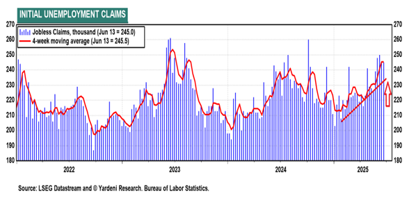
Take a look at the more real-time unemployment insurance claims data (shown above) which is reported every week and it’s a different picture…
As you can see, jobless claims have been on the rise this year. Up in 14 of the past 24 weeks to be exact.
The closely watched 4-week moving average of unemployment claims is up nearly 15% since January 1.
This hasn’t shown up (yet) in the “official” unemployment rate published monthly by BLS (dark blue line) as you can see below.
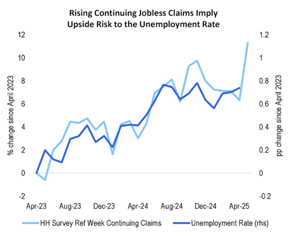
But it’s obvious from the surge in jobless claims that it soon will be a bigger problem.
Meanwhile, if you want a clearer picture of what’s really happening in the American work force, the folks at ADP have been producing private-sector employment reports for many years.
ADP’s data is collected from nearly half a million private sector businesses that hire the company to process their worker payrolls. So, it should be considered a lot more accurate.
And it’s no surprise that ADP’s numbers don’t jibe with BLS.
According to ADP, only 37,000 new jobs were added in the U.S. last month. That’s 70% less than BLS reported.
Plus, ADP’s tally of new jobs has been consistently lower than the government’s own numbers for the past three months.
Mike Burnick’s Bottom Line: Monthly BLS data is widely reported by the financial media, but that doesn’t mean it isn’t mostly BS. For my money, you should ignore it. Weekly jobless claims and especially the ADP private sector payroll data is what to watch if you want to understand the true employment picture.
Good investing,

Mike Burnick
Contributing Editor, Market Minute