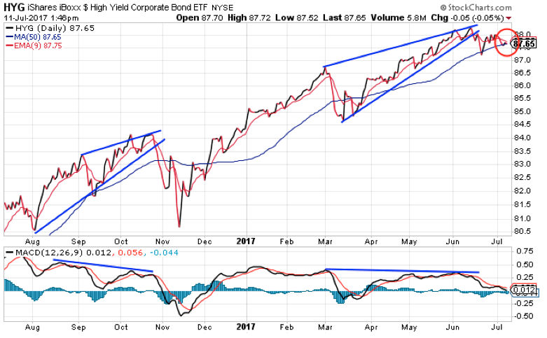
It’s been almost one month since we took a look at the high-yield bond market. Back then, the iShares iBoxx High Yield Corporate Bond Fund (HYG) was on the verge of breaking down from a bearish rising wedge pattern. And, since HYG typically leads the broad stock market, I argued that if HYG started to sell off, then the stock market wouldn’t be far behind.
Since then, HYG has stubbornly refused to break down. But the chart still looks ominous. And we could see a selloff any day now.
Take a look at this chart…

HYG broke down from its rising wedge pattern shortly after I wrote about it last month. The stock then found support at its 50-day moving average (MA) line – which is a logical spot at which to expect a bounce.
Since then, though, HYG has just been chopping back and forth. It’s just like the recent action in the stock market—all it’s doing is frustrating bulls and bears alike.
But it now looks like HYG is about to make a large move lower.
Look at the red circle on the chart. Notice how the 9-day exponential moving average (EMA) is declining and on the verge of crossing below the 50-day MA. This “bearish crossover” – if it happens – should kick off an intermediate-term decline phase for HYG. I expect that decline will be similar to the action in HYG last November.
That would likely create some selling pressure for the broad stock market.
Of course… there has to be some sort of a catalyst for that sort of move. Perhaps that catalyst will come from Fed Chair Janet Yellen when she offers her testimony today and Thursday.
We’ll see…
Best regards and good trading,

Jeff Clark
P.S. If you have any questions about my thoughts on the broad market, option trading, or have some great trading stories to share, be sure to send them to me right here.
