The bull market showed its resiliency again last Friday. The S&P 500 shrugged off an opening decline and recovered to close positive on the day. So, at the risk of being accused of singing the same old song, as long as the S&P continues to close above its 9-day exponential moving average (EMA), the bulls will keep the momentum and it’s too soon to get aggressive with trades on the short side.
Keep in mind, though, that the upside is limited here as well. The chart of the S&P shows negative divergence on a few technical indicators like the MACD momentum indicator and the Relative Strength Index (RSI). And VIX option prices remain skewed towards a higher VIX for the next few weeks – which usually means a lower stock market.
Traders are better off sitting on cash and waiting for the market to make a definitive move.
Personally, I’m leaning bearish. But I currently have only small exposure to the downside. I’m waiting for the S&P to close below its 9-day EMA. And I’m waiting for the high-yield bond market to break down.
The action in high-yield bonds tends to lead the action in the stock market by anywhere from a few days to a couple of weeks. So, by watching the action in high-yield bond funds like the iShares iBoxx High Yield Corporate Bond ETF (HYG) and the SPDR Bloomberg Barclays High Yield Bond ETF (JNK), traders can get a sneak peek at what might soon be happening in the broad stock market.
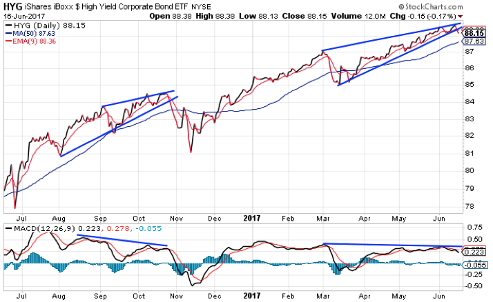
And this week could be decisive. Take a look at this chart of HYG…

For the past four months, HYG has been forming a bearish rising wedge pattern with negative divergence on the MACD momentum indicator. This pattern most often breaks to the downside in a sudden and significant manner.
For example, look at the selloff in HYG that happened in late October off of a similar pattern. HYG dropped 5% in about two weeks. A similar move this time would push HYG back down to its March low at about $85 per share.
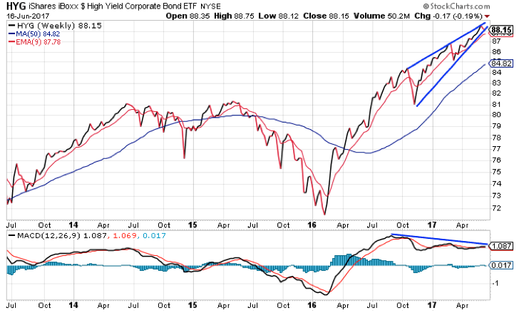
That would be enough to cause HYG to break down from a similar pattern on its weekly chart. Take a look…

Patterns on a weekly chart are more significant for the longer-term trend. You can see the same sort of rising wedge pattern with negative divergence on this chart. A breakdown from this pattern is more likely to signify that we’ve seen a top in the high-yield bond market.
And, since junk bonds tend to lead the action in stocks, a top in junk bonds will likely signal a significant top in stocks is coming soon.
This is a weekly chart. All that matters is how the pattern looks at the end of the week. So we’ll take another look at this chart on Friday.
Best regards and good trading,

Jeff Clark
P.S. Remember, if you have any questions, comments, or great trading stories you'd like to share, send them to me right here.
